A Definitive Essay on “Flat Art” (or, as I will be refusing to call it, “Corporate Memphis”)
The discourse around people who are tired of “flat art” has been going on for several years now. So I’ve been wanting to do a break down of where flat art comes from, what are the misconceptions, what are the criticisms, and which criticisms are worth paying attention to.
First, some history. Flat art dates back to cave paintings, literally the oldest known human art there is! But for our purposes, we’ll start at the birth of Modernism, in the late 19th century.
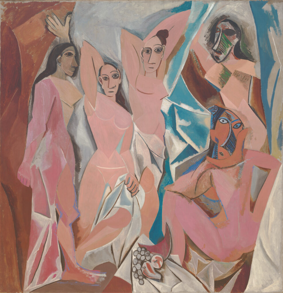
After centuries of realism, flat shapes and exaggerated proportions were exciting new concepts in Western art. Of course, these concepts already existed elsewhere, and Modernism borrowed heavily from the flatness of Japanese art, and the exaggerated proportions of African art.
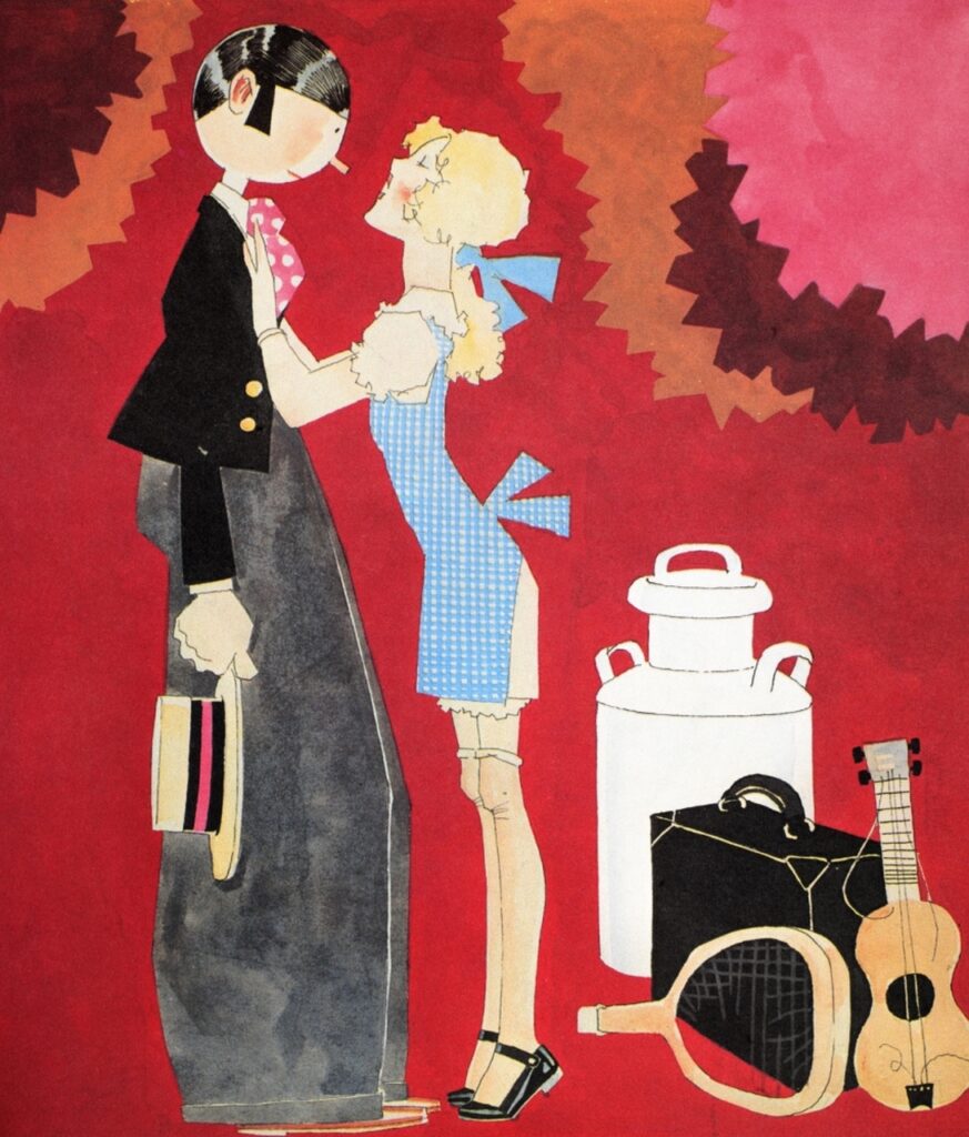
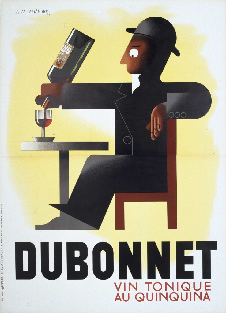
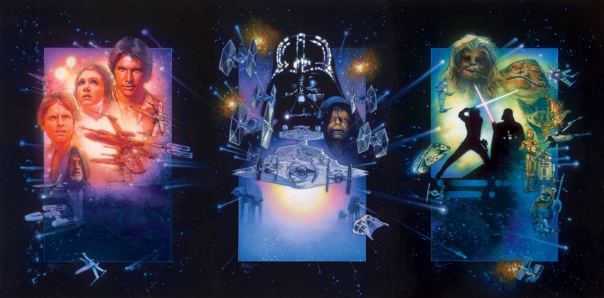
Modernism started to take hold in the world of illustration around the 1920s, especially in relation to art deco and the jazz age.
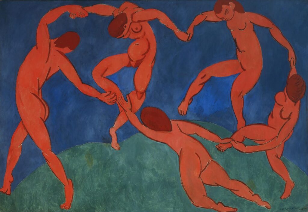
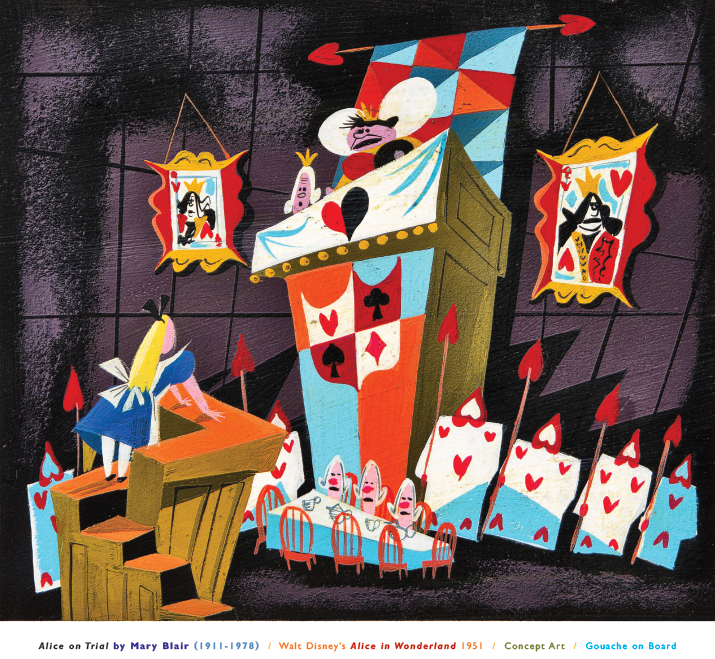
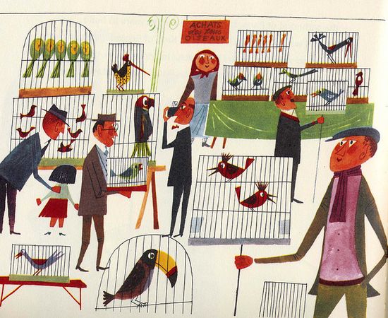
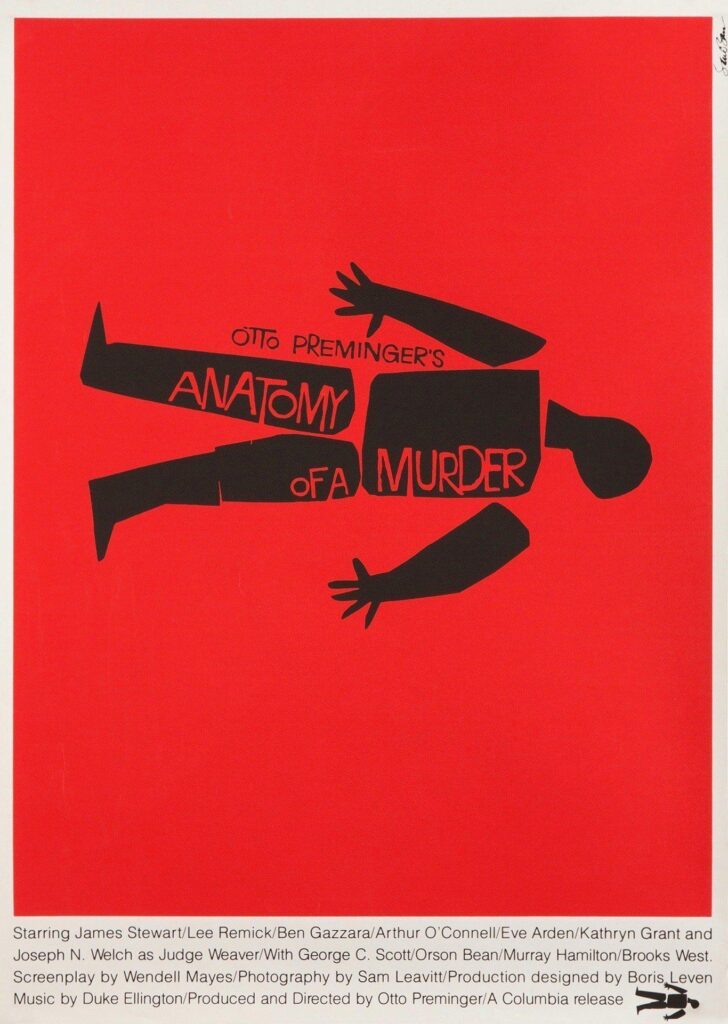
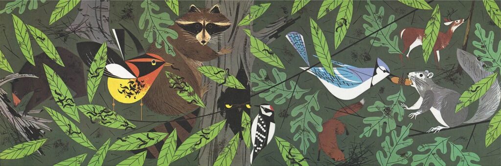
But a lot of flat artists today are inspired by the 50s and 60s, at the height of Modernism’s popularity. By this period, illustrators had perfected the art of abstraction. They learned how to pack a ton of personality into simple, flat shapes, and the results are still appealing
Of course, that pendulum is always swinging, and in the 70s and 80s there was a return to realism and painterly textures, as illustration’s general popularity slowly waned.
Now we get to the single biggest impact on contemporary illustration: the computer! People began experimenting with digital illustration in the 90s, though graphics programs were pretty limited. One thing the computer COULD do well was flat art. Or, more specifically, vector art.
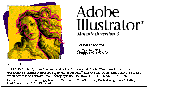
In 1987, Adobe had introduced their vector drawing program, Adobe Illustrator. In 2005, my professor was still teaching that the name was a misnomer because you couldn’t make illustrations with it. Lol. But the app held an appeal for digitally-savvy, shape-based artists like myself.
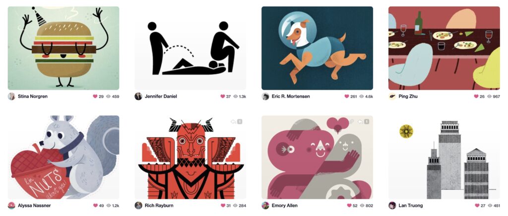
And so vector art began to develop as its own distinct style in the 2000s but especially the 2010s, aided, I suspect, by the rise of industry social media platform Dribbble.
Early on, many artists tried to mimic midcentury techniques, making their vectors look like blotted ink, brushed gouache, or mis-registered screenprints. Eventually, illustrators began embracing a more obviously digital look, while still using the 50s and 60s for inspiration.
As a side bar, this is why I hate the name “Corporate Memphis.” The style is neither inherently corporate (I’ll get to that later), nor is it in any way related to the 80s interior design movement Memphis. It takes its influence directly from midcentury modern illustration.
Flat art wasn’t quite in step with editorial or children’s book trends at the time. It certainly wasn’t popular with the industry’s traditional old guard. Just look at how underrepresented flat art has been in illustration annuals, despite being one of the dominant trends today.
That could just be a generational divide, though. I would hazard a guess that most artists working in this style are millennials. There’s something distinctly millennial about flat art’s embrace of new technology along with its slight nostalgia for the past.
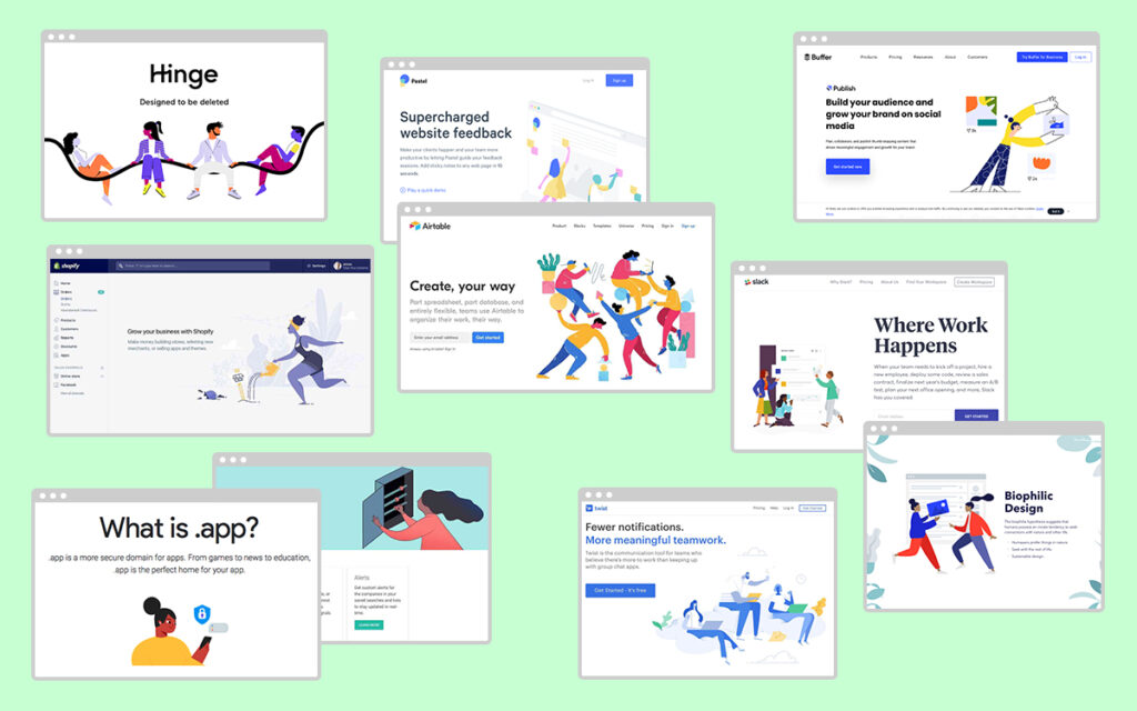
But hey, do you know who DID love this new vector art style? Tech startups. People in tech were also millennials, and liked digital art that looked digital. The retro inspiration gave this new style lots of colorful, friendly, appealing personality.

And vector art is also convenient for digital spaces like websites, scalable, easy to animate, and often quicker and cheaper to produce than traditional art.
It’s significant that tech brands were using illustration AT ALL considering most brands since the 60s had relied on photography. But tech products are hard to photograph. This represented a HUGE industry shift, and an increase in the public’s awareness of illustration IN GENERAL
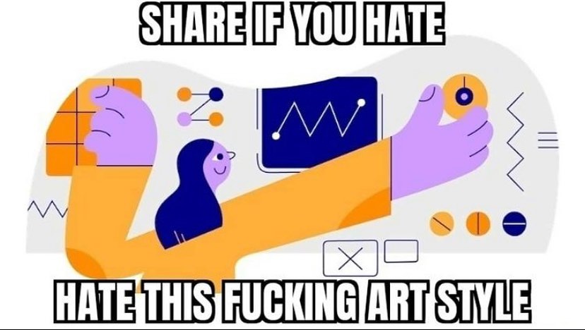
Flat vector art on tech websites reached peak saturation in 2017, when Facebook unveiled its new illustration system, which it called “Alegria.” Here’s the description from Buck, the design firm that created it: “We designed and built a scalable system rooted in flat, minimal, geometric shapes. The figures are abstracted — oversized limbs and non-representational skin colors help them instantly achieve a universal feel.”
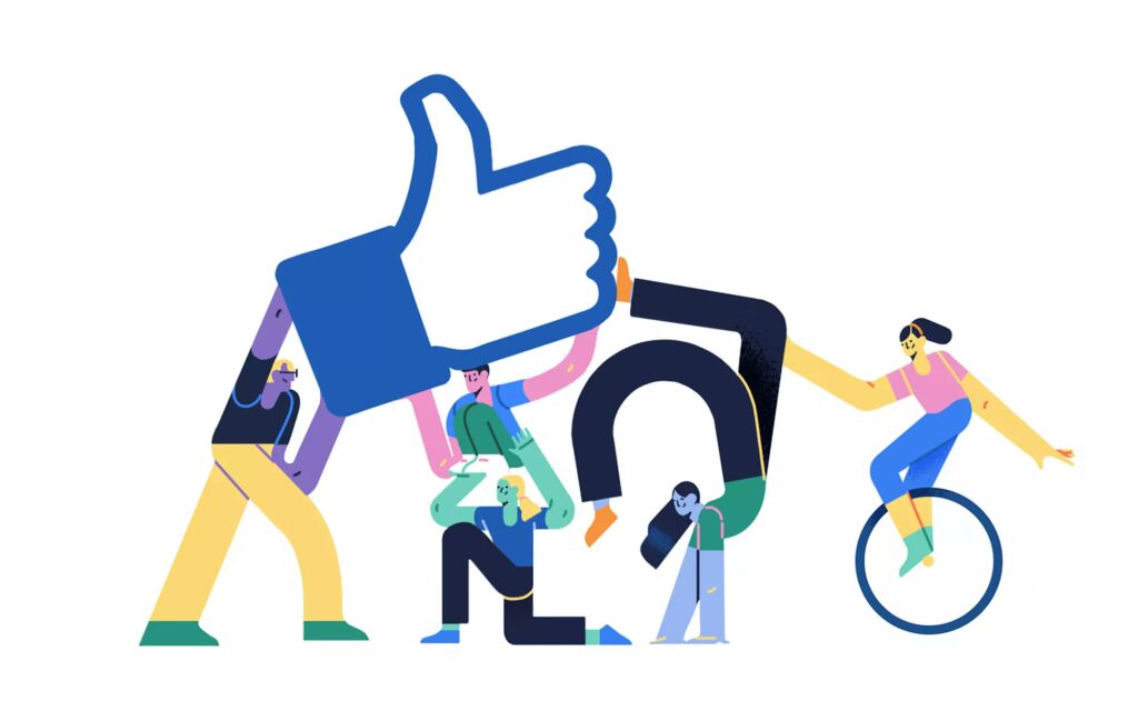
To be clear: Facebook did not invent this style! It was already popular, particularly among tech startups, when FB adopted their own version. But Alegria and its clones would dominate the conversation from here on out, and once FB adopts anything, you know the backlash is coming.
The public began noticing the ubiquity of flat art across the tech sphere (and it was finally starting to seep into editorial and children’s books as well). Their feelings about the style became wrapped up in their feelings about big tech.
There was a very hateful person (whom I won’t name), who had an entire account dedicated to bashing this illustration style (when he wasn’t busy being a bigot). Then came the Serious Design Articles written by non-illustrators. So let’s look at some of the criticisms:
1. “It all looks the same.”
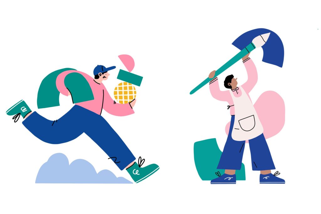
I’m sorry, but no it doesn’t. Like any style, flat art has a shared set of conventions: minimal texture and shading, exaggerated proportions, colorful geometric shapes, an embrace of looking digital. But within that, there is so much wonderful variety and imagination.


It’s also worth noting that a lot of the subpar flat art that you see out in the wild is actually cheap stock illustration, not the work of a hired illustrator. And I would argue that art movements should be judged by their best examples, not their worst.
2. “Flat art puts a friendly face on evil tech giants. It’s inherently corporate and capitalist.”
Ok, no. No art style is inherently corporate, because that describes how the illustrations are used, not how they look. It’s not the fault of talented illustrators that capitalism has co-opted an appealing and popular style for its own propaganda. That’s what capitalism does.

Ultimately, illustrators are commercial artists. We need to appeal to and be hired by capitalists, like any exploited worker. I’m not denying flat art’s association with big tech, I’m just saying it’s no more “corporate” than illustrating for the New York Times.
3. “It’s ugly.”
Eh, can’t please everyone. And if you personally don’t like this style, I’m sorry to say that’s still a minority opinion, at least for now.
4. “Flat art does not adequately portray diversity.”
This is the one criticism I take seriously! Go back and reread Facebook’s statement. When they say “non-representational skin colors,” what they mean is that you’ll see plenty of blue and purple people, but you will never see a Black person.
Too often I see flat artists using abstraction to *avoid* diversity, instead of learning how to draw simplified people with distinct ethnicities and body types. Don’t fall into this trap! Flat art and diversity can easily coexist when done right.


5. “Flat art is everywhere and I’m tired of it.”
Honestly, I get it. This style remains very popular for now, but TASTES CHANGE. This style won’t be popular forever, and we’re probably seeing the start of that pendulum swing. As illustrators, we should always be experimenting and pushing our work forward so that it doesn’t get stuck in the past.
In conclusion! “Flat art” is a style that combines the long tradition of Modernism, particularly midcentury illustration, with recent computer technology. It is a style that was developed by illustrators, then adopted by tech companies, NOT the other way around.
Whether you love it or hate it, eventually it will be replaced by a new style that will be a continuation of, and a rejection of, flat art. Until THAT style is also appropriated by capitalism, and then we’ll move on to the next one, and so on until we destroy capitalism for good.